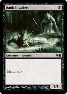
 Today we're covering Scott Chou's art work.
In completely arbitrary order:
A. I might have only given Amphibious Ambushers a B since I wasn't reading Flash from this art, but Chah basically nailed it. Hard to argue you with that.
C. This was the art I had the most trouble with. There have never been Merfolk on Ravnica before and the art looks terrible in a mono-blue or mono-green frame. I went with this because the art looks nice on a black frame and some cheap evasion would support Cipher.
A. While I stand firm that this art doesn't look good in a blue (or green) frame, Wizards did put it in a blue-green frame (where it also looks bad). The fact that this is 100% believable prevents me from rating this less than an A.
C. What everyone else figured out is that this is clearly a Simic card, because what other guild would have an out-of-place creature type that's traditionally blue? Swiftfin Krasis is a good name, but ultimately haste is out of place on a green card, and it's blue heritage doesn't help.
B. I love that Miguel's sorcery gives you two evolvers for one card. My only concern is how hard it may be to keep track of their size.
A. Not sure this effect is Simic, but it's quite green-blue and seriously sweet. Probably needs to be multicolored rather than hybrid.


Wild Surge is an awesome card. It probably needs to cost more, but I would love to see something like it printed.
ReplyDeleteBy the way, Jay, I've made versions of my submissions with flavor text. Could you use these mockups instead?
http://s835.beta.photobucket.com/user/Chah1/library/Custom%20Magic%20Cards/Gatecrash%20Fake%20Cards
Mine was 5U for a common 4/4 with Flash.
ReplyDelete